
Design & Layout
Design and layout settings control the visual appearance of the site. All options are found under Admin → Settings → Design.
Site Theme
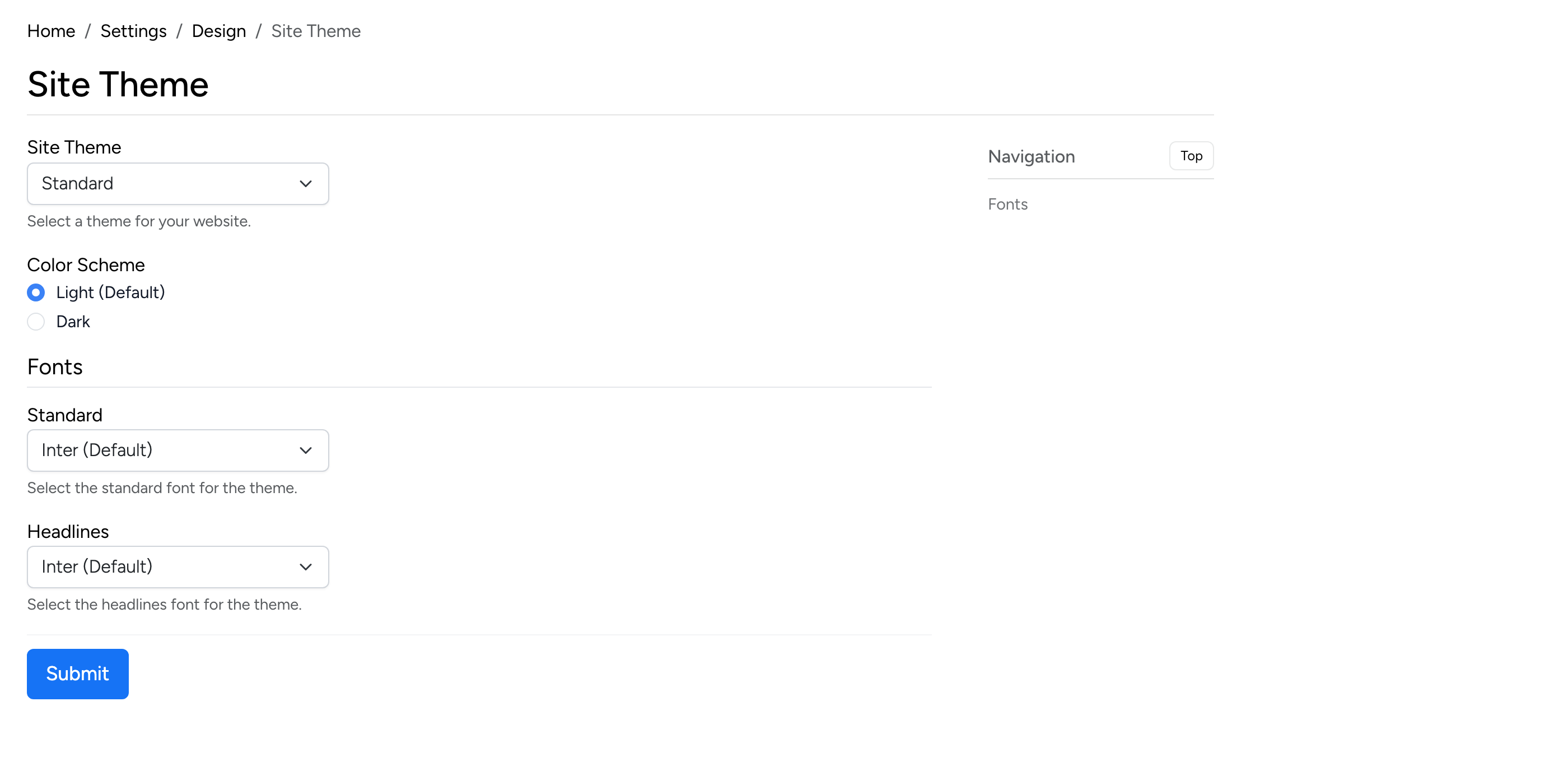
- Site Theme — select the active theme for the site.
- Color Scheme — choose between Light (default) and Dark mode.
- Fonts — select the standard body font and the headlines font. Both default to Inter.
Header
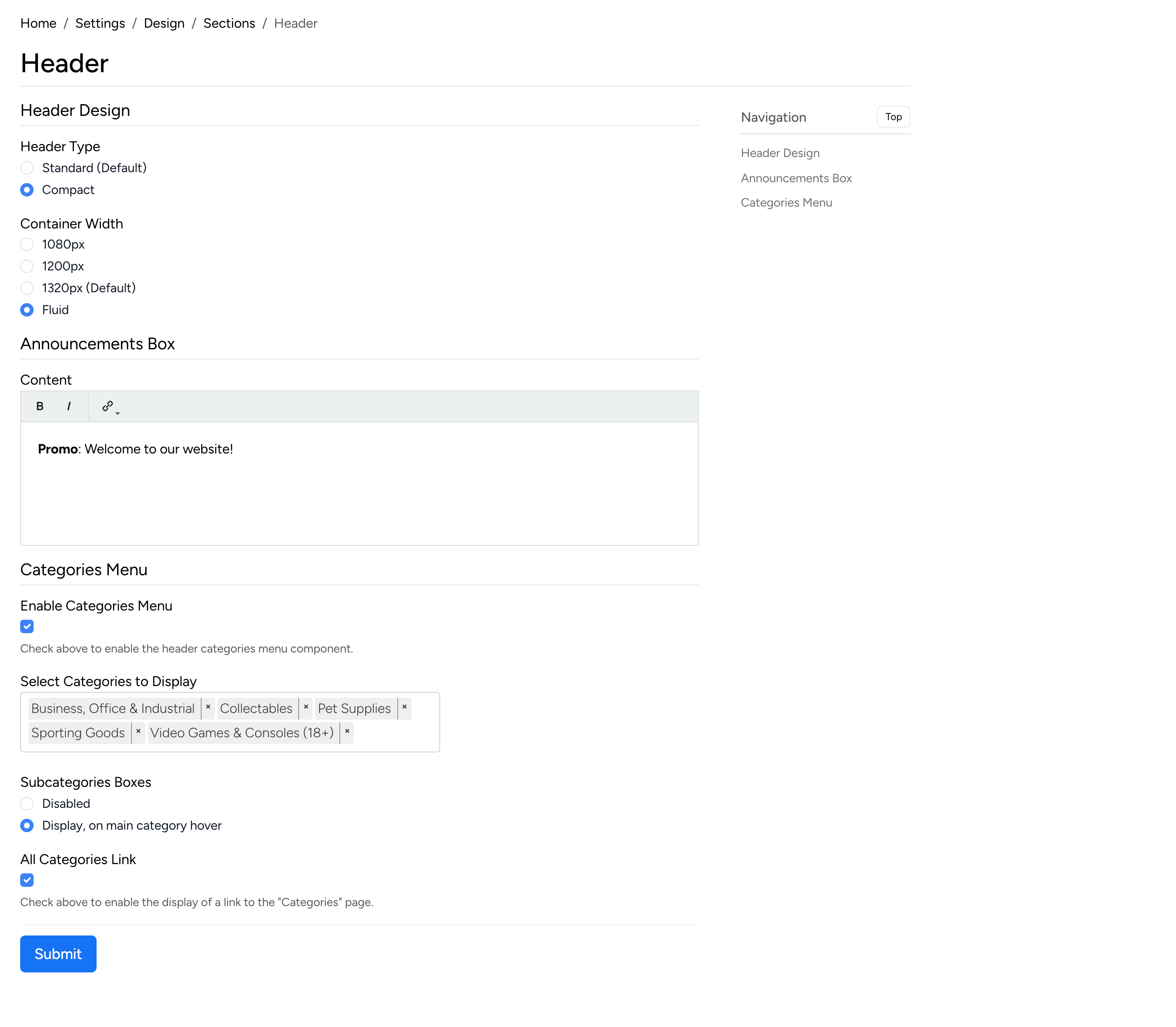
- Header Type — choose between Standard (default) and Compact header layouts.
- Container Width — set the header width: 1080px, 1200px, 1320px (default), or Fluid (full width).
- Announcements Box — add a promotional banner or announcement that appears at the top of the site using the rich text editor.
- Categories Menu — enable the categories navigation menu in the header. Select which categories to display and whether subcategory boxes appear on hover.
- All Categories Link — display a link to the full categories page in the menu.
Main Content
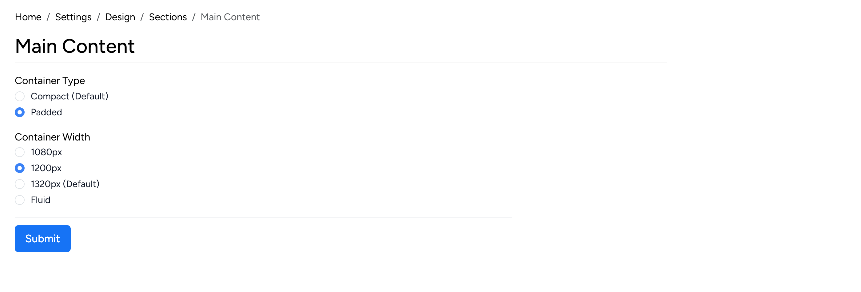
- Container Type — choose between Compact (default, no extra padding) and Padded (adds spacing around the content area).
- Container Width — set the main content area width: 1080px, 1200px, 1320px (default), or Fluid.
Home Page
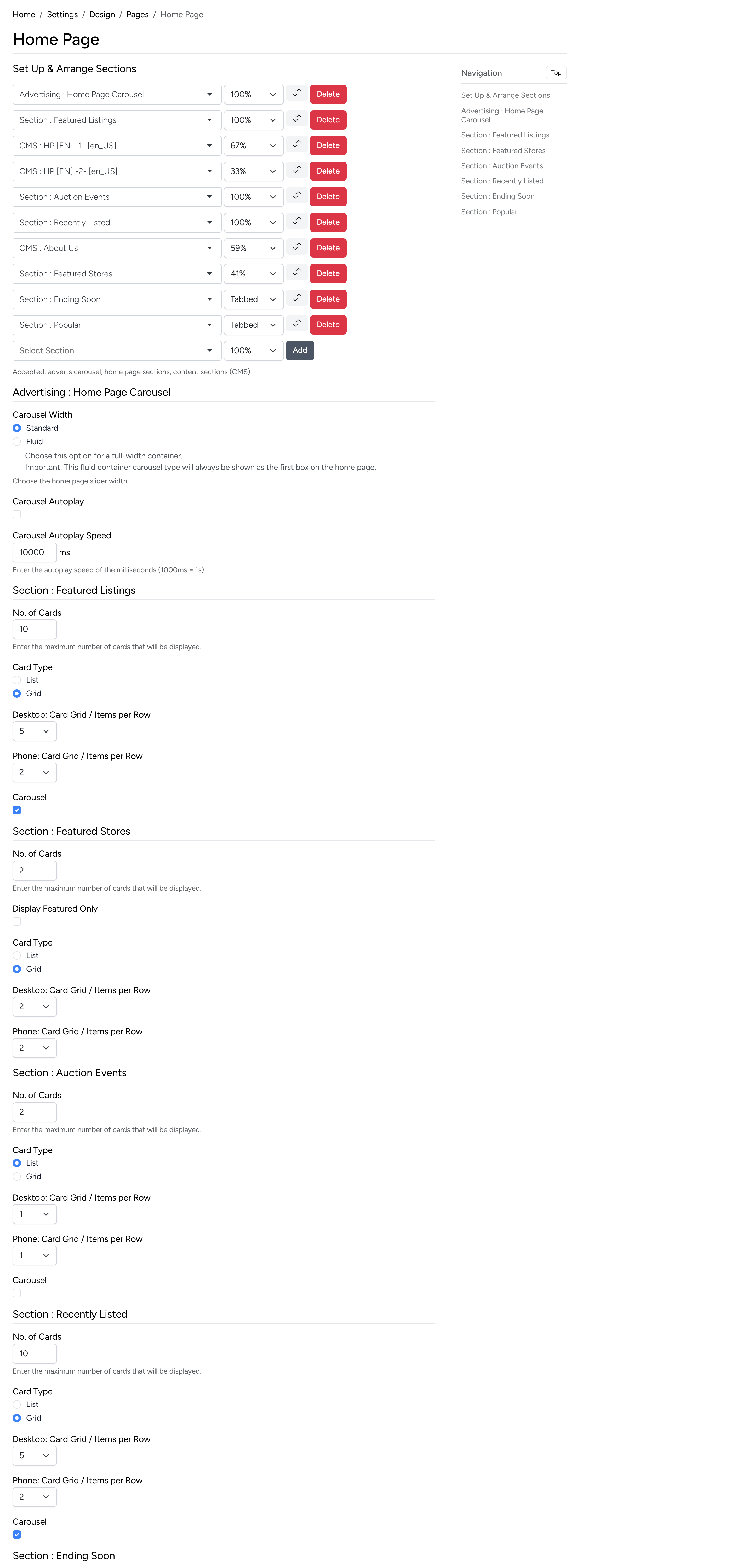
Configure the home page layout. The page is built from sections, each displaying a set of listings. For each section you can configure:
- No. of Cards — how many listing cards to display in the section.
- Card Type — List or Grid layout.
- Desktop / Phone: Items per Row — the number of cards per row for each screen size.
- Carousel — enable horizontal scrolling for the section.
- Display Featured Only — only show featured listings in the section.
The top of the page also includes carousel settings: width (Standard or Fluid), autoplay toggle, and autoplay speed.
Listing Details
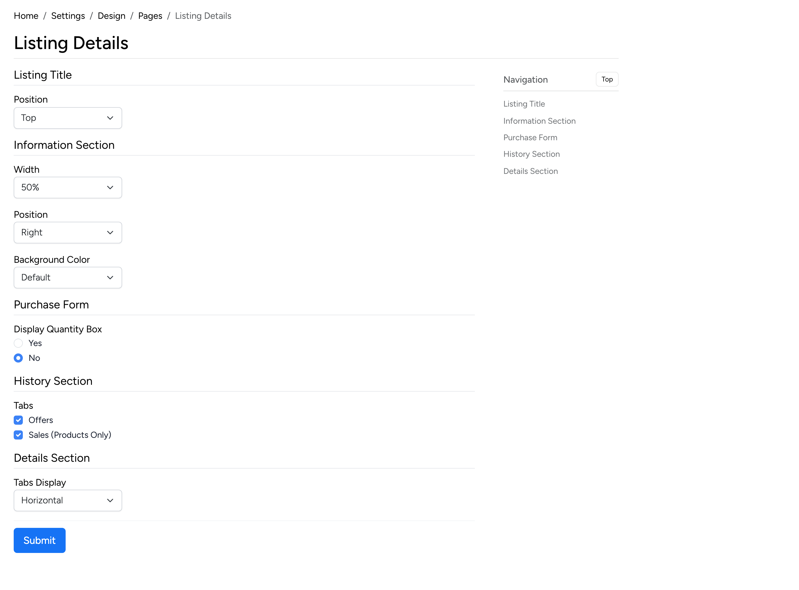
- Listing Title — Position — where the listing title appears on the detail page (Top or Inside).
- Information Section — configure the width (50% / 100%), position (Left / Right), and background color of the listing information panel.
- Purchase Form — Display Quantity Box — show or hide the quantity selector on product listings.
- History Section — Tabs — select which history tabs are visible: Offers and Sales (Products Only).
- Details Section — Tabs Display — choose between Horizontal and Vertical tab layout for the listing details section.
Listing Card
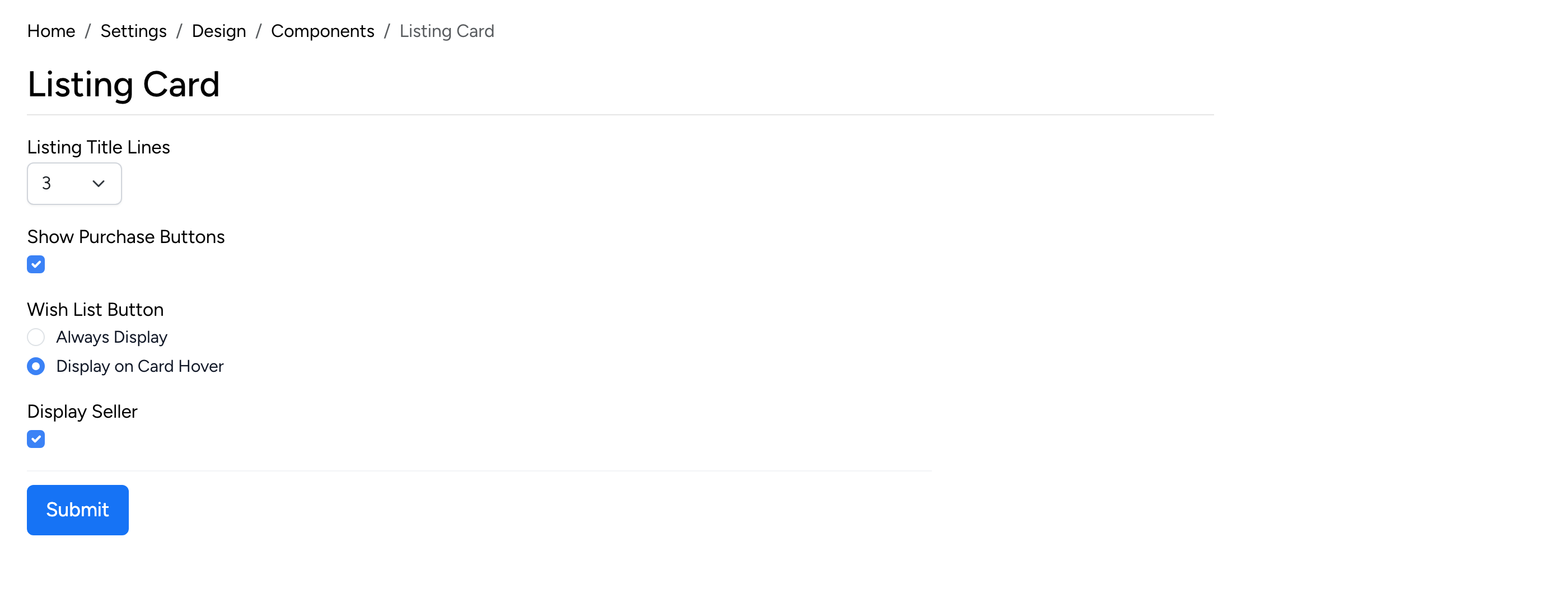
- Listing Title Lines — the maximum number of text lines for the listing title on cards (e.g. 3).
- Show Purchase Buttons — display Buy Now or Bid buttons directly on listing cards.
- Wish List Button — choose between Always Display or Display on Card Hover.
- Display Seller — show the seller’s name on listing cards.
Language Selector
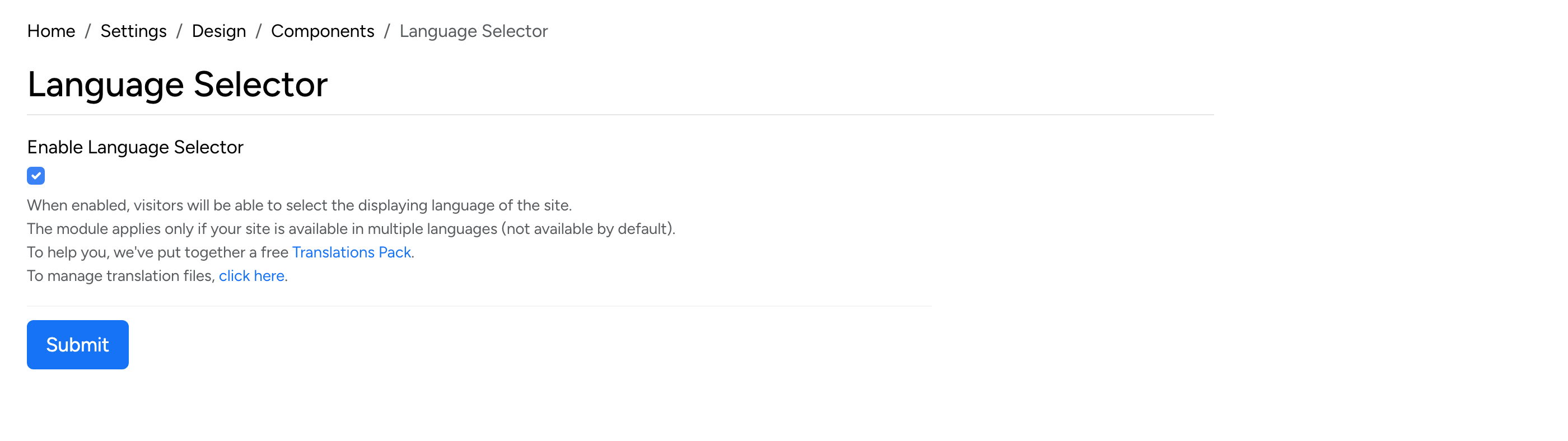
- Enable Language Selector — when checked, visitors can switch the site language from a dropdown. This only applies if the site has multiple languages installed.
Recently Viewed Listings
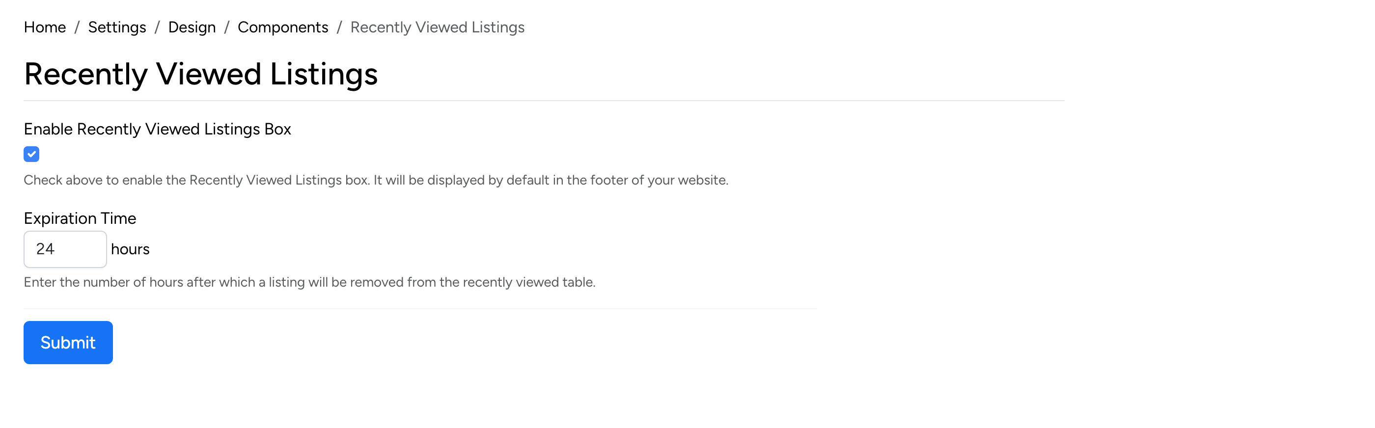
- Enable Recently Viewed Listings Box — when checked, a “Recently Viewed” section is displayed in the site footer showing listings the visitor has previously viewed.
- Expiration Time — the number of hours after which a listing is removed from the recently viewed list.